


WELCOME HANDBOOK 2022 / 23
CREATIVE
Redesigning the student handbook for the opening of freshers. Having manipulated and re-established the styling of the existing branding for QMU, to be more playful - we emulated the feeling of the website into the publication for a holistic design.


WEB
CASE STUDY:
PROBLEMS:
The QMU earn most of their revenue through events and related streams of income. Thus, they wanted a website redesign that reflected and pushed this. Focussing on events, small local gigs, and boosting the venue space.
PAIN POINTS:
Changing the perception of the Union - previously dubbed as ‘Alternative’, it came with associations and assumptions that they found detrimental. While not inaccurate we wanted to change these assumptions - keywords like progressive, welcoming, and versatile came to mind.
The existing website was a result of many collaborators and contributors - over the years as the executive team changes each academic year. Being built progressively in parts opposed to being designed with intent.
The QMU wanted to focus very heavily on making the space exciting, lively and youthful, to attract a reliable and consistent event-goers. Expanding on their already vibrant history in the music scene in Glasgow.
Moving forwards with their new slogan “making noise since 1890” - really reflects this.
"WE NEED TO CHANGE FOCUS"


DESIGN:
With an existing rebrand, we had constraints to work within - finding ways to play and adapt the theme while developing the visual language.
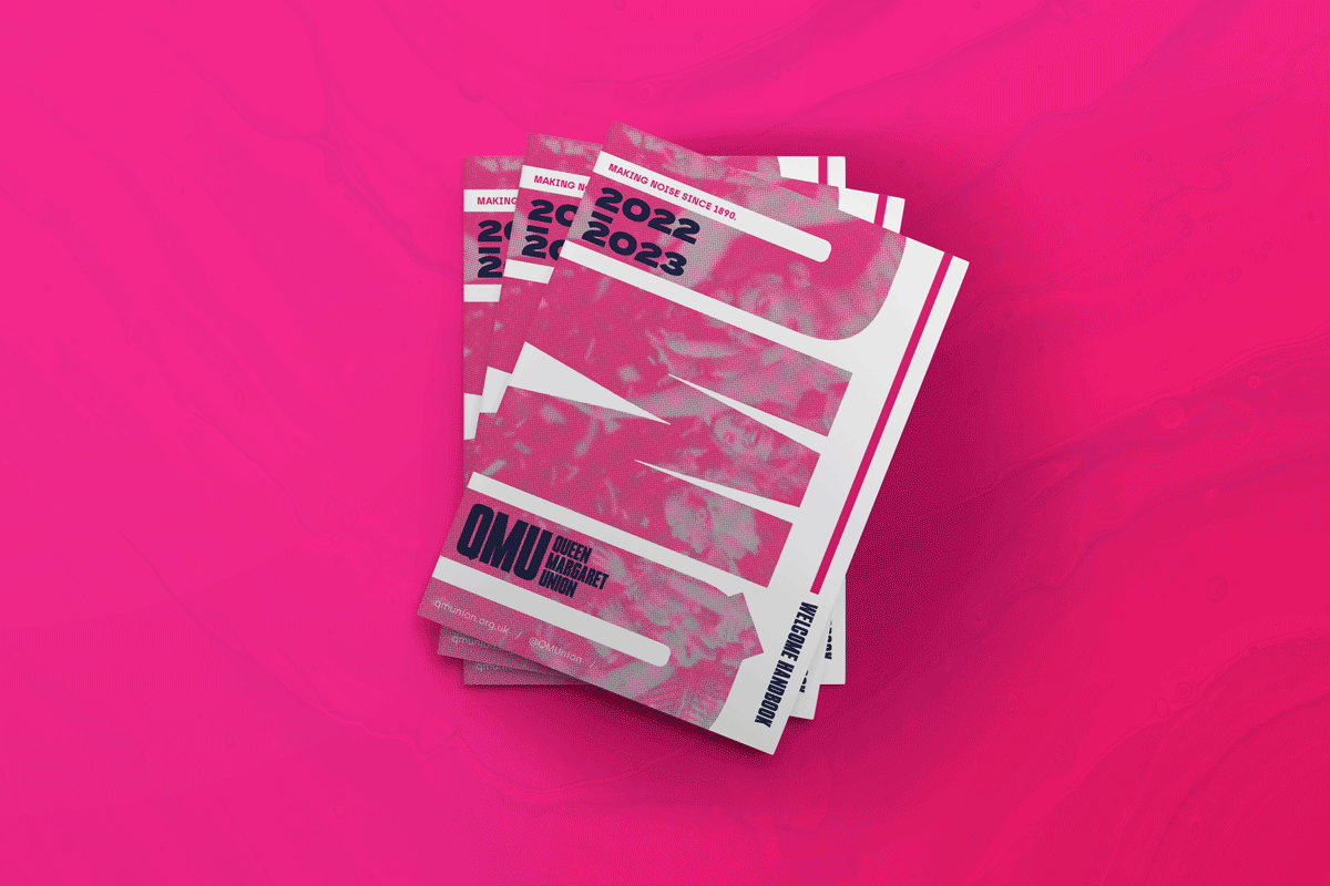
HANDBOOK:
During this refurbishment, they also requested an updated handbook in time for their Freshers launch. We took this as an opportunity to further play and expand the brand and visual identity in print, as well as in responsive digital design.
THE RESULTS:
A playful, youthful website, that is focussed on directing traffic to the plethora of live music gigs, and making a feature of the building and the spaces for student-lead, community-lead or commercial hiring.
Additionally a vibrant new handbook, that reflects the excitement of the space and the potential it could hold for joining students.
